Which core to believe? Trimmed mean versus ex-food-and-energy inflation
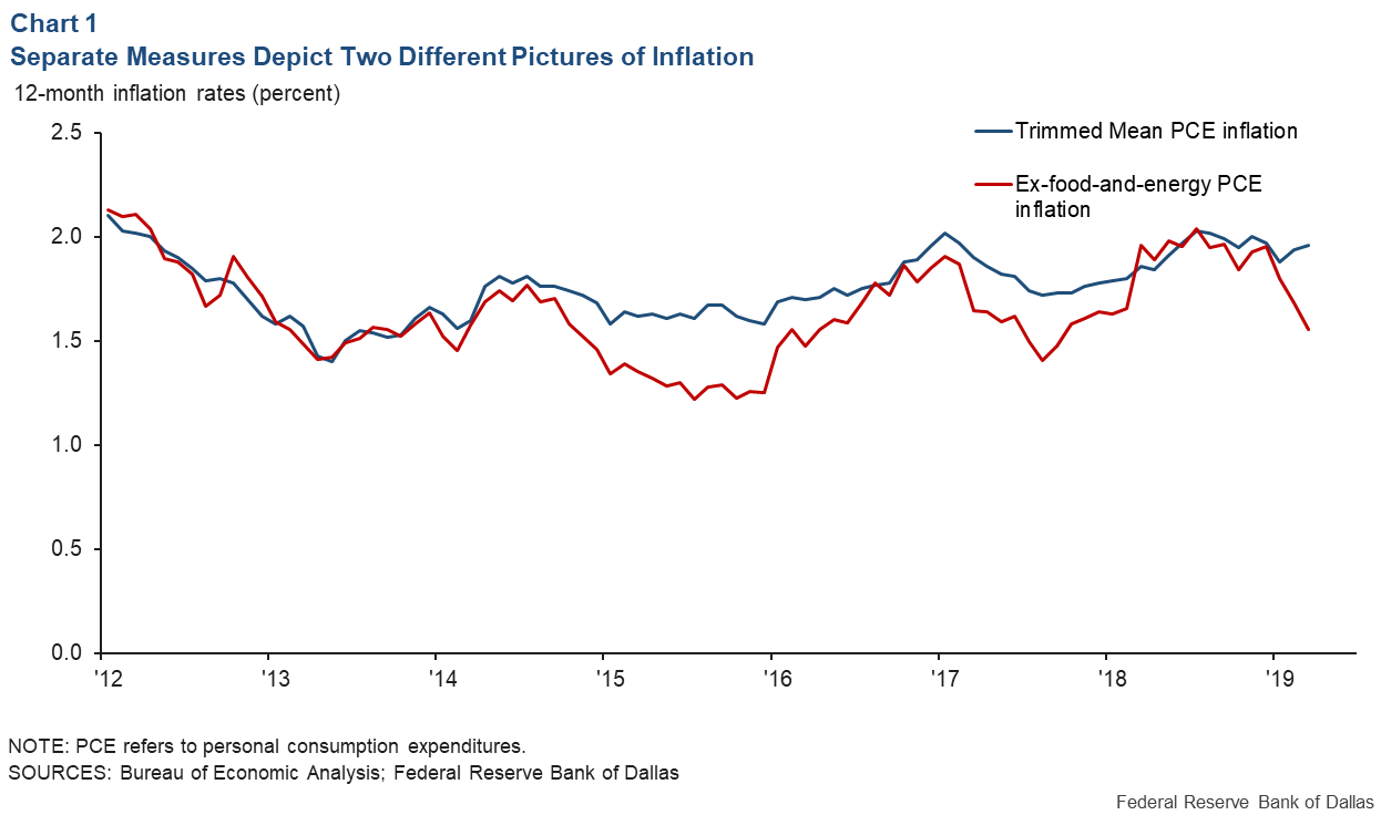
Twice since 2014, core personal consumption expenditures (PCE) inflation—inflation excluding food and energy—decelerated sharply, only to ultimately reverse course. The Dallas Fed’s Trimmed Mean PCE inflation rate correctly identified the downward moves as transitory, and looked through them (Chart 1).

Giving more weight to one or the other of these inflation measures would have led to rather different assessments of appropriate policy. Recent data suggest that another divergence is emerging, and the conflicting signals have brought renewed attention to the trimmed mean.
We argue here that the trimmed mean, which excludes the most extreme price changes in consumer goods and services each month, provides better real-time signals of the trend in all-items (headline) inflation than does the usual ex-food-and-energy measure. Along the way, we discuss the “why” and “how” of the trimmed mean’s construction.
In a follow-up piece drawing on some of our recent research, we’ll explore another trimmed mean advantage over ex-food-and-energy inflation: its stronger, more stable response to cyclical conditions.
The why ...
To address the “why,” it’s useful to step back and consider core inflation measures more generally.
While most central banks describe their inflation goals in terms of an all-items price index, all-items inflation can be extremely volatile, even averaged over 12-month periods. Moreover, much of that volatility has nothing to do with the economy’s cyclical behavior or the central bank’s policy actions.
The volatility in all-items inflation can make it hard for policymakers to discern the effects of cyclical pressures on inflation or, conversely, to make inferences about the economy’s cyclical state from inflation data. Core inflation measures can help if they strip out noise and better reveal the cyclical signal.
The best-known core measures are those excluding food and energy prices. Members of the Federal Reserve’s policymaking Federal Open Market Committee (FOMC) regularly submit forecasts for this type of core inflation measure, along with their forecasts for all-items PCE inflation.
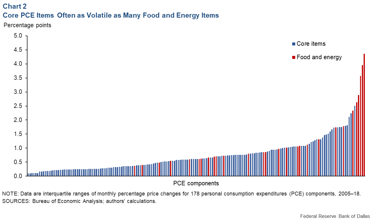
Ex-food-and-energy measures have some intuitive appeal—food and energy prices are generally quite volatile, in ways that often have little to do with the state of the economy. Digging a bit deeper into the data, though, reveals that simply excluding all food and energy (and only food and energy) is not an efficient way to strip out noise.
Chart 2 shows the volatility of month-to-month price changes for 178 items in the PCE basket, sorted from least to most volatile. We measure an item’s volatility as the interquartile range of its monthly price changes, the distance between the item’s 25th percentile price change (25 percent of the item’s monthly price changes are less than this value) and its 75th percentile price change (25 percent of the monthly price changes are higher than this value). A wider interquartile range indicates more extreme low and high price changes.

Outside the top spots in the ranking, food and energy items are interspersed with comparably volatile nonfood, nonenergy items. In fact, about 14 percent of food and energy items (by expenditure share) are less volatile than the typical nonfood, nonenergy item; likewise, about 14 percent of the nonfood, nonenergy items are more volatile than the typical food and energy item.
Identifying unwanted volatility with food and energy will end up throwing out some signals (less-volatile food and energy items) and allow some noise (more-volatile nonfood, nonenergy items). The trimmed mean addresses this deficiency by excluding the most extreme price changes each month, regardless of an item’s identity.
A more rigorous case for trimming comes from the observation that the distributions of monthly price changes are “fat tailed”—relative to a normal bell curve—with many more observations at extreme high and low values. An old literature in statistics tells us that when a distribution has fat tails, the sample average—in our case, the average of all the price changes observed in a given month—is a very noisy estimator of the distribution’s central tendency, or typical value. This literature tells us that taking the average after trimming observations from the tails reduces the noise.
And the how …
The Dallas Fed calculates the trimmed mean inflation rate each month using price and expenditure data for 178 PCE components published by the Bureau of Economic Analysis. Price changes from the prior month are calculated for all the components and sorted from lowest to highest. In March, for example, the extremes were the price indexes for tax preparation, which declined at a 62 percent annualized rate, and for watches, which rose at a 138 percent annualized rate.
Once the price changes are sorted, the lowest 24 percent (using components’ expenditure weights) and highest 31 percent are excluded, or “trimmed.” The trimmed mean inflation rate for the month is the weighted average—using the expenditure weights—of the price changes left in the middle.
The 24 and 31 percent trimming proportions were chosen to produce an inflation series that came closest to a measure of all-items PCE trend inflation. The proportions have been fixed since the trimmed mean’s last major revision in 2009.
We’re glossing over a few technical details here, particularly regarding the weights, which are a bit more complicated than simple expenditure shares, and the notion of trend that the trimming proportions were chosen to target. Readers interested in those particular nuts and bolts can find them here.
Smoother, less-biased real-time signals
So, what sort of inflation measure does this process produce? As one might expect, the trimmed mean inflation rate is substantially less volatile than headline or ex-food-and-energy inflation. From 1993 to 2018, the interquartile range of annualized monthly trimmed mean inflation rates was just 0.8 percentage points, compared with 1.3 percentage points for ex-food-and-energy inflation and 2.3 percentage points for headline inflation.
Moreover, real-time trimmed mean inflation rates—the data as they are initially available, before revisions—have on average been less biased, measured against latest-vintage headline inflation, than have real-time ex-food-and-energy inflation rates. We emphasize the signals from real-time data here because these are the signals FOMC policymakers will have in hand when decisions need to be made.
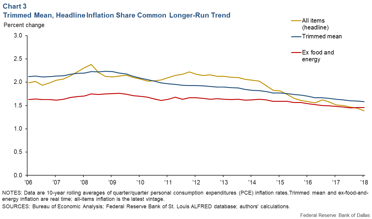
Since 2005—when real-time trimmed mean data were first calculated—quarterly headline PCE inflation has averaged 1.77 percent, while real-time quarterly trimmed mean inflation has averaged 1.78 percent. Real-time quarterly ex-food-and-energy inflation has averaged 1.61 percent.
While real-time trimmed mean inflation has been sometimes above and sometimes below headline inflation, ex-food-and-energy inflation has been more often below headline (Chart 3). Less volatility and little bias are to be expected, given the trimmed mean’s design.

About the Authors
The views expressed are those of the authors and should not be attributed to the Federal Reserve Bank of Dallas or the Federal Reserve System.

